One Room Challenge Week Three: Entrance Hall
Susana Chango
How is it already Week Three?! If you're stumbling upon this cold, I'm participating in Calling it Home's One Room Challenge, and this is the third of six posts sharing a room make-over. To catch up with my project, go here and here. I'm redoing the entry of my friend, Jane, and you can see our newest inspiration above. Susana Chango designed this gorgeous entrance. The architectural style, the paint color, and the stair runner are very similar to what we're doing.
Here's Jane's entry before.
This is what it looks like presently. The painting should be finished by Friday, and we can already tell that the impact of the different color is huge. Jane chose Farrow and Ball's All White. When I took this photo, they hadn't begun painting the woodwork. I can't say enough about how much I love this white paint. White isn't necessarily easy. It can go harsh, or have undertones of any number of colors for which I don't care. This one is soft, and just right.
Here's another before shot taken from the front door. At the top of Jane's priority list was a stair runner. Between the white paint and the runner, this room will be much lighter. In addition to brightening the space, the runner will add softness and plenty of texture.
Jane chose to have the runner made from Karastan's Cobble Ridge which has a fantastic herringbone pattern. She's using antiqued brass rods with the runner, and below is a photo showing her choices used together.
Here's a before view from the stairs. In a rush to get something on the floor after moving in, Jane ordered this area rug online considering it to be temporary. A nicer, more attractive rug was also on Jane's list for this project. It's right at the front door, and obviously plays an important role in the initial impression.
Again, we chose another Karastan carpet to use for the area rug. I love the subtle stripe in this pattern. It's called Wool Crochet, and it's going to be amazing paired with the stair runner. I'm so excited to have found two options that work so well together. That they're different will provide interest, yet they're close enough to keep the eye moving instead of creating breaks.
Jane couldn't wait to take the mirror off the wall. It was from her previous house, and had served as a place holder for too long. She's just beside herself that Christina Baker agreed to paint what will be the focal point of the entry.
Message in a Bottle
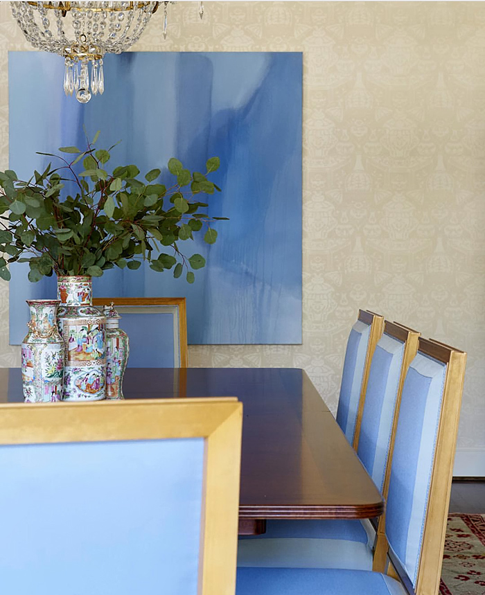
This isn't the painting for Jane's entry, but the colors will be similar. Everything Christina does is just breathtaking. A large scale piece like this is the most important and impactful element. We know that whatever Christina creates will be spectacular.
Lastly, here are the two Lee Jofa fabrics (here and here) that will be used for the chair in the entry. They're even prettier in person. I ordered them through DecoratorsBest, and they arrived today.
I have other plans for this project, and will share more next Wednesday. Thank you for checking on my One Room Challenge! Don't miss all of the other extremely busy participants:
Apartment 34 | Arianna Belle | Because It’s Awesome | Coco+Kelley | Design Darling | Design Indulgence |Design Manifest | Christine Dovey | The English Room | Vanessa Frances | Hi Sugarplum | Honey We’re Home | Jojotastic | The Pink Clutch | The Pink Pagoda | Simplified Bee | Style Your Senses | A Thoughtful Place | Kimberly Whitman | The Zhush | TM by CIH


