2014 Fall One Room Challenge || Final Week
Thank you for coming to see my completed entrance hall. I redesigned our very tired and lifeless entry for The One Room Challenge. You can catch up and see "before" shots here. It's been so much fun working with this space, and I'm thrilled with the results. How exciting to get to share it with you today!
Above and below is the view from the front door.
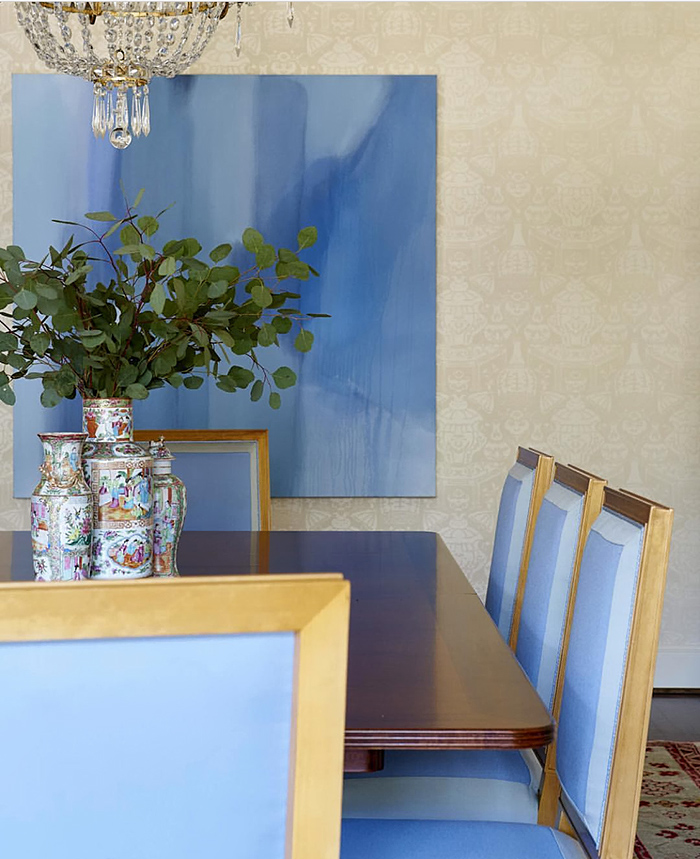
These are the beyond breathtaking panels that Christina Baker painted for the entry. I'm not sure if from the photos you can get a true understanding of the impact these panels create. In person they're even more beautiful, and I'm wanting to spend lots of time on the settee enjoying the view. Christina was absolutely lovely to work with. Besides these to-die-for paintings I get to enjoy everyday, it was fantastic getting to know and work with her. Her work is available at Gregg Irby Fine Art, and also can be seen on her site.
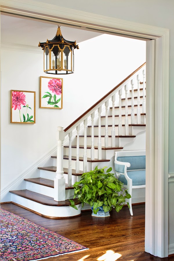
And, here is the spectacular lantern Coleen Rider, of Coleen and Company, custom designed for my entry. As of today, it's available on her site. I'm still pinching myself that this even happened. Coleen's spontaneity in taking this on was impressive, and I'm grateful she did! I gave her the dimensions of the entry, and she created a drop dead gorgeous piece that's the perfect scale for the space. This new lantern has elevated my entry so very much. Could it possibly be more perfect for me?
All of the Coleen and Company lighting is handmade by metal artisans in Los Angeles, and this image shows the handmade quality. Can you believe those bells?!
Another piece that adds much to the entry is this semi-antique Persian Kerman rug I found on eBay. Purchasing a rug on eBay was a tad bit stressful, but I'm so happy I took the chance. The colors and size are a perfect fit.
I love the addition of this settee. You can see the before and after here. Decorators Best helped me with the Stroheim Velvet Strie which is unbelievable. It's the prettiest blue velvet I've seen. Again and Again's lacquering and upholstery job is exquisite.
This image is from my dining room looking through the entry into the living room. I asked Laura Row to create the two peony watercolors you see at the base of the stairs. What I love is that they're botanicals, but the crop makes them more graphic and interesting. Basically, they're a fresh update to a classic look I've always loved. And peonies. That, too.
Didn't she do an amazing job? The colors flow seamlessly with Christina's paintings, and provide the perfect foil to the abstract panels.
I'm not sure if I've mentioned that I found the settee at a local consignment store and had it lacquered and reupholstered. The sconce is one of a pair my mother loaned me. I'm happy to have it in my possession for the time being.
The landing looked empty, and it was easy to find just the thing. You can never go wrong with a ginger jar, can you?
I like at least one green plant in every room. If you look through the entry into the family room, you'll see another. This one warms and softens the space.
The look and feel of our entry is now entirely different. It makes me so happy to walk through this space, and the other members of the family love it as well. This was the 6th ORC in which I've participated, and it was by far the hardest. You can't tell by looking, but much more time, thought, and effort went into this one. If you have any experience, you know that "less" is often times harder to pull off than "more." This was my first experience with this level of "less," and I learned so much through the process. Now that the entry is finished, I wish I'd done it a long time ago. Thank goodness Linda, of Calling it Home, created this One Room Challenge event. If it weren't for the fun of ORC, I doubt if I'd be motivated to find the time to change anything around our house!
I very much appreciate everyone who worked with me on this project. Their links are below.
SOURCES:
pagoda lantern | paintings | fabric | lacquer and upholstery | watercolors | art hanging | rug pad | rug cleaning | chandelier repair | consignment store | planter | ginger jar | photography
There are so many seriously amazing rooms that you don't want to miss. Be sure to go visit these talented ORC participants:
Trademarked by Calling it Home
With these, and the One Room Challenge Linking Participants that will be up tomorrow at Calling it Home, I'll be at my computer for days. So many newly designed rooms to visit -- FUN!
Photography by Jason Kindig


