Posts

Showing posts with the label 2014 Fall One Room Challenge

2014 Fall One Room Challenge || Final Week
Image
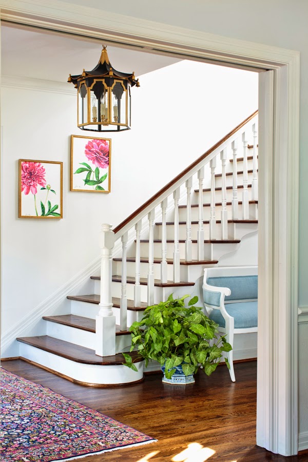
Thank you for coming to see my completed entrance hall. I redesigned our very tired and lifeless entry for The One Room Challenge. You can catch up and see "before" shots  here .  It's been so much fun working with this space, and I'm thrilled with the results.  How exciting to get to share it with you today! Above and below is the view from the front door. These are the beyond breathtaking panels that Christina Baker painted for the entry.  I'm not sure if from the photos you can get a true understanding of the impact these panels create.  In person they're even more beautiful, and I'm wanting to spend lots of time on the settee enjoying the view. Christina was absolutely lovely to work with. Besides these to-die-for paintings I get to enjoy everyday, it was fantastic getting to know and work with her. Her work is available at Gregg Irby Fine Art , and also can be seen on her site . And, here is the spectacular lant...

2014 Fall One Room Challenge || Week Five

Image
Thank you for visiting Week Five of my One Room Challenge!  To catch up, go here . One of the most exciting aspects of my entry is the custom pagoda lantern that Coleen Rider of Coleen & Company has designed for me.  I know you're dying to get a glimpse of where this is going, and below you can see Coleen's sketch.   Isn't her design FANTASTIC?!!  Do you have any idea how excited I am about this?  It's hanging in my house this very minute, and I couldn't possibly love it more.  Coleen nailed it.  This lantern is spectacular!  Not only is the design spot on for my entry, the scale is perfect.  I gave her the dimensions of the space, and she created a fixture that fits the room flawlessly.  I'm sure that my space constraints weren't the easiest.  My ceilings aren't terribly high, and, in addition to the dimensions of the space, Coleen had to consider my husband's height. Avoiding bloodshed is always best, so...

2014 Fall One Room Challenge || Week Four

Image
Thank you for visiting my Week Four of the One Room Challenge! To catch up on what the ORC is, and my first three weeks, go here . I'm redesigning my entrance hall, and above is a close up from the rug I found for the space. I adore Persian rugs.  Of all of the different types of Persians, my favorite are Kerman rugs (also spelled Kirman).  The colors and patterns used in Kermans are lovely.  The one above is in my living room, and is 12x17.5.  What I needed for the entry was 5x8.  I learned an interesting lesson about shopping for Persian rugs.  I found out that there's a different level of motivation to help one find a size similar to my living room rug than one the size of my entry. I ended up finding exactly what I needed on eBay, THANK GOODNESS.  I can't imagine one I'd like better, and the size is as though it was made for this spot. And, eBay prices are usually better than in the rug showrooms around here.  I think I held my bre...

2014 Fall One Room Challenge Week Three

Image
I'm happy you're here to see my One Room Challenge Week Three progress! If you missed Weeks 1 and 2, go here .  The ORC is a room redesign event shared over six weekly posts created and organized by Linda from Calling it Home .   Here's my entrance hall pre-ORC.  As you can see, it needed some life.  It was meh (lackluster, uninspiring or unexceptional).  Below is the settee I shared last week that will be placed in the entry. I found it at a local consignment store summer before last and have been hoarding it.  It had to be lacquered and reupholstered. The fabrics with asterisks were contenders. I also considered this Charlotte Moss fabric, but decided a solid should happen. Every other fabric was forgotten when I saw this Stroheim Velvet Strie in Sky . The gorgeousness doesn't come completely through in photos -- you have to see it in person.  It's really just luscious. I saw it in a Stroheim fabric book and too...

2014 Fall One Room Challenge || Week Two

Image
Thank you for visiting my Week Two of The One Room Challenge!  If you missed Week One, go here .  I'm redesigning my entrance hall, so it makes sense to start with the exterior. This is an illustration of our house painted by Laura Row . The walk up is clearly classic.  My strong but inexperienced opinion is that what you see as you walk up to the house should be in keeping with what you're greeted with upon entering. Basically, I believe in flow.  To describe the style I prefer, I'd use the words classic, fresh, tailored, and understated.  That's what I'm wanting in the entry. What I have now isn't fresh. In fact, it feels stuffy.  It's what just happened when we moved in seven years ago and placed here what fit from the previous house.  Here's the before. This is what our entry looks like this week.  I'm so happy with the white paint. Seeing it empty like this helps me see the possibilities. The sideboard that protrud...